Your Guide to Platform UX Design
Updated: October 20, 2025

Platform UX design is the art and science of creating a single, unified experience that stretches across multiple products and devices. It’s not just about making one app look good; it's about ensuring a user's journey is seamless whether they're on their phone, a website, or even a smartwatch. Get this right, and your brand feels consistent and reliable everywhere a user finds you.

What Is Platform UX Design Anyway?#
Think of a well-designed theme park. Every sign, ride, shop, and map shares the same visual style and logic. You instinctively know how to find your way around because the entire park—the "platform"—was built with one cohesive vision. That’s the core idea behind platform UX design.
It moves beyond the boundaries of a single application to focus on the entire ecosystem of digital touchpoints. The goal is to make every interaction feel familiar and interconnected, no matter the device. For modern products that don't live in just one place, this strategy isn't just nice to have; it's essential.
The Bigger Picture of User Experience#
Platform UX forces us to ask bigger questions than traditional app design. Instead of obsessing over a single user flow on one screen, it zooms out to consider the entire user journey across every device. This means designers have to think about how all the different pieces of the puzzle fit together to create a unified whole.
The key goals here are pretty straightforward:
- Create Predictability: Users shouldn't have to relearn your service just because they switched from their laptop to their phone. The rules should feel the same everywhere.
- Build Brand Trust: A consistent experience at every touchpoint reinforces your brand’s reliability and professionalism. It just feels more solid.
- Improve User Retention: When an entire ecosystem is intuitive and easy to navigate, users are far more likely to stay engaged with all parts of it.
This shift in focus from a single product to a whole ecosystem is becoming more vital every year. The global UX services market is projected to skyrocket from $2.59 billion in 2022 to nearly $33 billion by 2030, a clear sign of how much businesses are investing in superior, unified user journeys.
A strong platform UX strategy ensures that the user feels like they are interacting with one intelligent entity, not a collection of separate, disconnected apps.
For developers tasked with building these interconnected experiences, making the right foundational choices from the start is critical. Understanding the trade-offs, like those in our guide on native vs. hybrid app development, is crucial for achieving true platform cohesion. It's about making your services feel like a single, helpful assistant that’s available wherever your users need it.
Core Principles of a Unified Experience#
To create a platform UX that actually works, you need to build it on a few solid principles. These aren't just fluffy design school concepts; they're the ground rules that guide every decision you make. Following them is the difference between building a single, seamless service and just a bunch of disconnected apps.
Think of these principles as the architectural blueprint for your user's entire journey with your product. Get them right, and you create an experience that feels intuitive, reliable, and builds trust every step of the way. The goal? Make moving between your website and mobile app feel as natural as breathing.
Consistency: The Familiar Foundation#
Consistency is the most obvious principle, but it’s also the easiest to mess up. It’s all about creating a uniform look, feel, and set of behaviors across your entire platform. This means using the same color palette, typography, button styles, and interaction patterns everywhere you can.
When users see a familiar icon or button, they already know what it does without thinking. This instantly lowers their cognitive load.
Look at Google's suite of products—it's a masterclass in consistency. The clean, card-based layout and Material Design components in Gmail, Google Calendar, and Google Docs make each app feel immediately recognizable. You just know how to use it. That kind of harmony is the bedrock of a great platform UX.
This infographic breaks down how consistency, context, and continuity all have to work together.
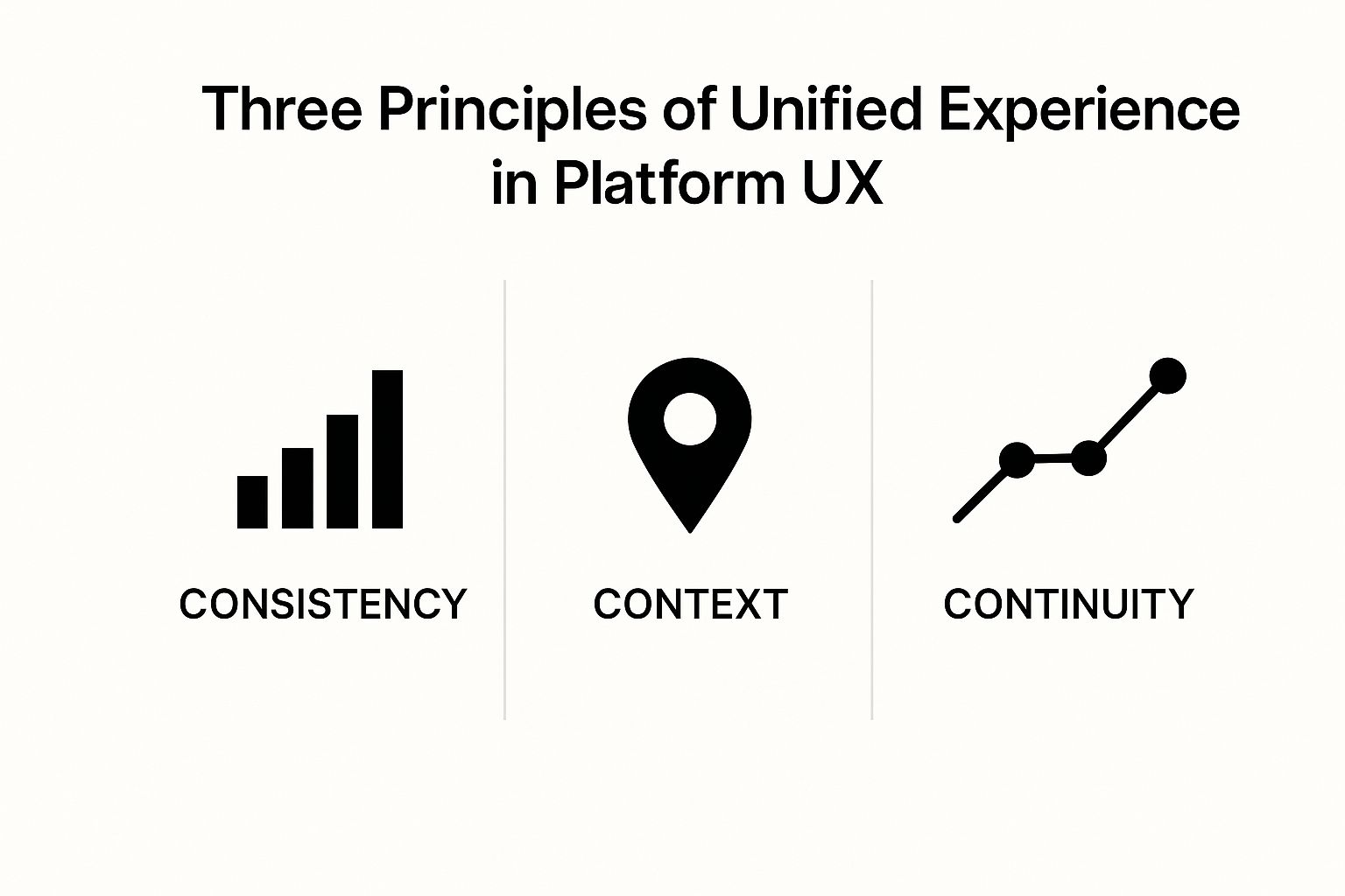
As you can see, a killer platform experience isn't about just one thing. It's about the interplay between a familiar interface, smart features that understand the user's situation, and a journey that never hits a dead end.
Cohesion and Context: Working Together#
While consistency is about making things the same, cohesion is about making different parts work together in a way that just makes sense. It ensures features across your platform feel logically connected. A perfect example is adding an event to your calendar directly from an email invitation. That’s strong cohesion—two separate parts of the platform working together to help the user get something done fast.
Context takes this a step further by actually adapting the experience to the user's specific situation. Someone checking your service on a smartwatch needs a radically different interface than someone sitting in front of a 32-inch monitor.
A truly great platform experience doesn't just look the same everywhere; it intelligently adapts to meet the user's needs in their current context, whether they have two seconds on a watch or two hours at a desk.
This adaptive mindset is a huge part of our philosophy. In fact, many of the mobile app UI design best practices we swear by are all about understanding and designing for specific device contexts.
Continuity: The Unbroken Journey#
Finally, continuity is the glue that holds everything together. It’s what lets a user start a task on one device and seamlessly pick it right back up on another without losing their place. Think about starting an article on your phone during your commute and finishing it on your laptop when you get to the office. That’s continuity.
Getting this right requires some serious planning behind the scenes, especially with data synchronization and state management. When you nail continuity, the boundaries between devices just seem to disappear. It solidifies the feeling that you've built a single, intelligent platform that works for the user, wherever they are.
Using Cross Platform Design Patterns#

If design principles are the "why," then design patterns are the "how." These are the real, reusable building blocks we use to solve common interface problems in a predictable way. Think of them as proven recipes that make an experience feel seamless across different devices.
Nailing these patterns is a huge part of great platform UX. They’re what turn abstract goals like "consistency" and "continuity" into a functional, user-friendly reality. Let's dig into a few of the most important ones.
Universal Navigation and Components#
One of the most powerful patterns is a universal navigation system. A classic example is a persistent bottom tab bar in a mobile app that mirrors the main navigation links in a website header. Users just know where to find "Home," "Search," or "Profile"—no hunting required, no matter the device.
This is usually powered by a shared component library, a central collection of UI elements like buttons, forms, and icons. By pulling from the same library everywhere, you guarantee visual and functional consistency with way less effort. This approach is absolutely essential when you want to build cross-platform mobile apps that feel like they belong to a bigger digital ecosystem.
Adaptive Layouts and Data Sync#
Another crucial pattern is the adaptive layout. This goes way beyond just making a design responsive. An adaptive layout intelligently reconfigures content and features based on the screen real estate and what the device can do. A complex data table on a desktop dashboard might smartly transform into a simplified, tappable list on a phone, showing only the most critical info first.
The magic of great platform UX is when the user feels the experience was designed specifically for the device they're holding, yet everything is exactly where they expect it to be.
This kind of seamlessness is only possible with flawless data synchronization. This pattern ensures a user's information is always current across every touchpoint. When someone updates a task in a tool like Trello or Asana on their phone, that change has to show up instantly on the web dashboard and any browser extensions.
This table shows how a single core pattern—in this case, task management—gets adapted for different contexts while still feeling like one cohesive experience.
Platform Pattern Implementation Across Devices#
| Device Context | Primary User Goal | Key UI/UX Implementation |
|---|---|---|
| Mobile App | Quickly add or check off a task on the go. | A simplified "Add Task" button is prominent. Task lists are vertical and easily scannable with swipe gestures for completion. |
| Web Dashboard | Get a comprehensive overview and manage project details. | A multi-column layout (e.g., Kanban board) shows the full project scope. Detailed task editing with deadlines and assignments is available. |
| Browser Extension | Capture a new task from a webpage with minimal disruption. | A small pop-up modal allows for quick task entry without leaving the current website. It auto-fills relevant data like the URL. |
By thoughtfully applying these patterns, you create an ecosystem where each part is perfectly tuned for its context but remains harmoniously linked to the whole.
How AI Is Shaping Platform UX#

The world of design is always moving, but Artificial Intelligence isn't just another trend—it's a fundamental shift. Far from being some far-off sci-fi concept, AI is a practical tool that’s already here, reshaping platform UX to make experiences smarter, faster, and more personal than ever before.
One of the most obvious wins is AI-powered personalization. Instead of forcing every user down the same path, platforms can now adapt content, recommendations, and even entire layouts based on what an individual actually does. This creates a more relevant, engaging experience that feels like it was built just for them.
Then there's predictive analytics, which lets us anticipate what a user needs before they even know they need it. By analyzing patterns in user data, AI can forecast what someone might want to do next, helping designers build interfaces that feel less reactive and more intuitive.
The New Creative Collaborator#
There’s this common fear that AI is coming to replace human designers, but that’s a complete misunderstanding of its role. The reality is much more interesting: AI is becoming an incredibly powerful creative partner. It’s brilliant at handling the repetitive, soul-crushing tasks that bog us down, freeing designers to focus on what we do best—strategy and creative problem-solving.
This shift is already happening. AI-powered tools are changing perceptions of who can design and how long it should take, which naturally affects the value we place on design work itself.
AI is not here to take your job; it's here to take your tedious tasks. It automates the mundane so you can focus on the meaningful.
This collaborative dynamic lets designers work faster and explore more creative ideas than ever before. If you're curious about the tech that makes these features possible, looking into no-code AI backend solutions offers a great window into how these systems are actually built.
Practical Applications of AI in Design#
AI’s impact isn’t just theoretical. It’s already showing up in tangible ways that improve both the design workflow and the final user experience.
Here are a few ways it's making a real difference:
- Generative AI for Mockups: Tools can now spit out entire design mockups, color palettes, and component variations from a simple text prompt. This massively accelerates the early ideation phase.
- Automated Accessibility Audits: AI can scan designs and code to flag accessibility problems and even suggest fixes, making it easier to build more inclusive platforms for everyone.
- Intelligent User Flow Analysis: By crunching user session data, AI can pinpoint friction points in user journeys that a human might miss, pointing us directly to the areas that need fixing.
You can see these concepts come together in sophisticated apps. For a real-world example, check out how we approached building an AI plant identifier app, where machine learning is at the very core of the user experience. By embracing AI, we can build platforms that are more intelligent, more adaptive, and ultimately, more human.
Best Practices for Your Next Project#
Turning all this platform theory into a real-world product that people love requires a clear, actionable game plan. Kicking off a platform UX design project without a solid strategy is a lot like trying to build a house without a blueprint. You might get a wall up, but the whole thing is likely to come crashing down.
The following best practices are your field guide. They'll help you sidestep the common traps and build a cohesive, scalable, and user-friendly ecosystem right from the start. Think of this as a checklist to keep your teams aligned and your project pointed in the right direction.
Establish a Centralized Design System#
First things first: build a centralized Design System. This is way more than just a style guide or a collection of colors. It's the single source of truth for your entire platform, containing reusable components, clear interaction patterns, and guidelines that guarantee consistency across every single app and device.
Starting with a Design System from day one prevents what I call "design drift"—that all-too-common scenario where different teams create slightly different versions of the same button or user flow. This not only keeps the user experience clean and predictable but also dramatically speeds up development. Teams can pull from a pre-approved library instead of reinventing the wheel every single time.
Adopt a Platform-First Mindset#
To build something that feels truly unified, your teams have to stop thinking in silos. A "platform-first" mindset means every designer and developer understands how their piece of the puzzle fits into the larger user journey. It’s about breaking down those invisible organizational walls and fostering a culture of genuine collaboration.
Your users don't see your company's org chart—they just see one brand. A platform-first approach ensures the user experience reflects a single, unified vision, not a collection of disconnected team projects.
Encourage cross-team workshops and get everyone on shared collaboration tools to keep them aligned. When the entire crew is working from the same playbook, the end product feels intentional and harmoniously integrated.
For platforms built for developers, focusing on their experience is just as crucial. A great UX for your internal teams pays dividends, and you can find some fantastic insights by exploring resources on improving developer experience.
Conduct Holistic User Research#
Finally, your user research has to look at the entire cross-platform journey. Don't just test how a user completes a task on the mobile app in isolation. You need to map out how they might start on their phone during their commute, continue on their laptop at the office, and maybe finish up on a tablet from the couch.
This holistic view is the only way to uncover the critical friction points that happen between devices. You’ll miss them otherwise. To get this right, you can use a few proven methods:
- Journey Mapping: Visualize the user's entire path across every touchpoint. This is where you’ll spot the pain points and find the biggest opportunities for improvement.
- Diary Studies: Ask users to document their interactions with your platform over several days. This gives you a raw, unfiltered look into real-world usage patterns.
- Contextual Inquiries: Go observe users in their natural environment. See how they actually switch between devices to get things done. It’s often not what you’d expect.
By weaving these technical and cultural practices together, you’re laying a rock-solid foundation for your platform. This approach also lines up perfectly with many of the core mobile development best practices that ensure your apps are stable, scalable, and a genuine joy to use.
Even with a clear roadmap, diving into platform UX can bring up some tricky questions. It's a big-picture way of thinking that shifts your focus from a single app to an entire ecosystem. Getting your head around that shift is often the biggest hurdle.
Let’s tackle some of the most common questions designers and developers have when they start trying to build a truly unified experience.
What Is the Biggest Difference Between Platform UX and App UX?#
The main difference is scope. Simple as that.
Traditional app UX is hyper-focused on crafting a great experience within one single, standalone application. You’re making that one app as intuitive and effective as possible on one specific device. It’s a self-contained world.
Platform UX design, on the other hand, thinks much, much bigger. It's about designing an interconnected system of experiences that work harmoniously across multiple touchpoints—like a mobile app, a website, a tablet view, and even a smartwatch app. The challenge isn't just making one part usable; it's making sure the entire ecosystem feels like a single, intelligent service.
The goal is to let a user move seamlessly from their phone to their laptop without ever feeling like they’ve left your world.
How Do I Start Implementing a Platform UX Strategy?#
Starting can feel like you're trying to boil the ocean, but the best first step is to build a centralized Design System. Think of it as a living collection of reusable components, established patterns, and clear guidelines that can be shared across all your products. It’s your single source of truth that ensures a button or a color scheme is consistent everywhere. This is what prevents design drift and makes development so much faster down the road.
A Design System isn't just a project—it's a product that serves other products. Investing in it early pays off by creating consistency and efficiency at scale.
While you're building your Design System, you should also run a "journey audit." This just means mapping out exactly how users currently interact with your different products and, more importantly, where they hit roadblocks. This audit will quickly reveal the painful inconsistencies and friction points across your platform, giving you a clear, prioritized list of what to fix first.
Are There Any Tools Specifically for Platform UX Design?#
There isn't a single magic "platform UX tool," but the process relies on a modern stack of design and collaboration software working together. The real key is to choose tools that encourage consistency and create a shared understanding across teams.
Here are the essentials you'll likely need:
- Design and Prototyping: Figma is the undisputed king for platform work. Its cloud-based nature and powerful component libraries make it perfect for building and maintaining a shared Design System that everyone can access.
- Collaboration and Mapping: Tools like Miro or FigJam are non-negotiable for visualizing the entire cross-platform experience. They help teams create user journey maps and brainstorm solutions together in a way that just works.
- Prototyping Simulators: Advanced prototyping tools can help simulate the transitions between different devices, letting you test the continuity of the user's journey from one screen to the next.
Ultimately, the best toolset is one that breaks down silos and gets your entire team—from design to development—working from the same playbook.
Ready to build your own cohesive mobile experience without the native headache? NextNative provides production-ready boilerplates using Next.js, so you can focus on great platform UX instead of complex setup. Get started with NextNative today.