9 Mobile App UI Design Best Practices for 2025
Updated: July 20, 2025
In a crowded app market, a visually stunning and intuitive user interface is not just a nice-to-have; it is the critical factor that separates a five-star favorite from an app that gets deleted in minutes. Your UI is the first, and often last, impression you will make. It is the direct line of communication between your user and the powerful functionality you have built. A great UI reduces friction, boosts engagement, and ultimately builds a loyal user base that translates into tangible success.
But what separates merely good design from a truly great user experience? It is about moving beyond surface-level aesthetics and implementing proven principles that enhance usability, performance, and accessibility at every tap and swipe. For developers and founders aiming to deploy cross-platform applications rapidly, mastering these fundamentals is non-negotiable for launching a successful MVP and scaling it effectively.
This guide cuts through the noise and dives deep into the most essential mobile app UI design best practices. We will unpack nine core principles, providing the actionable insights, practical examples, and implementation details you need to craft an interface that is not just functional, but unforgettable. Whether you are a full-stack developer leveraging web skills for native apps or a startup founder building your first product, these strategies will equip you to create an experience your users will genuinely love and return to again and again. Let’s get straight to the principles that will make your app stand out.
1. Mobile-First Responsive Design#
One of the most foundational mobile app UI design best practices is embracing a mobile-first approach. Coined by Google's Luke Wroblewski, this strategy flips traditional design on its head. Instead of designing for a large desktop screen and then trying to cram everything into a smaller mobile view, you start with the most constrained environment: the mobile screen. This forces you to prioritize what truly matters to your users.
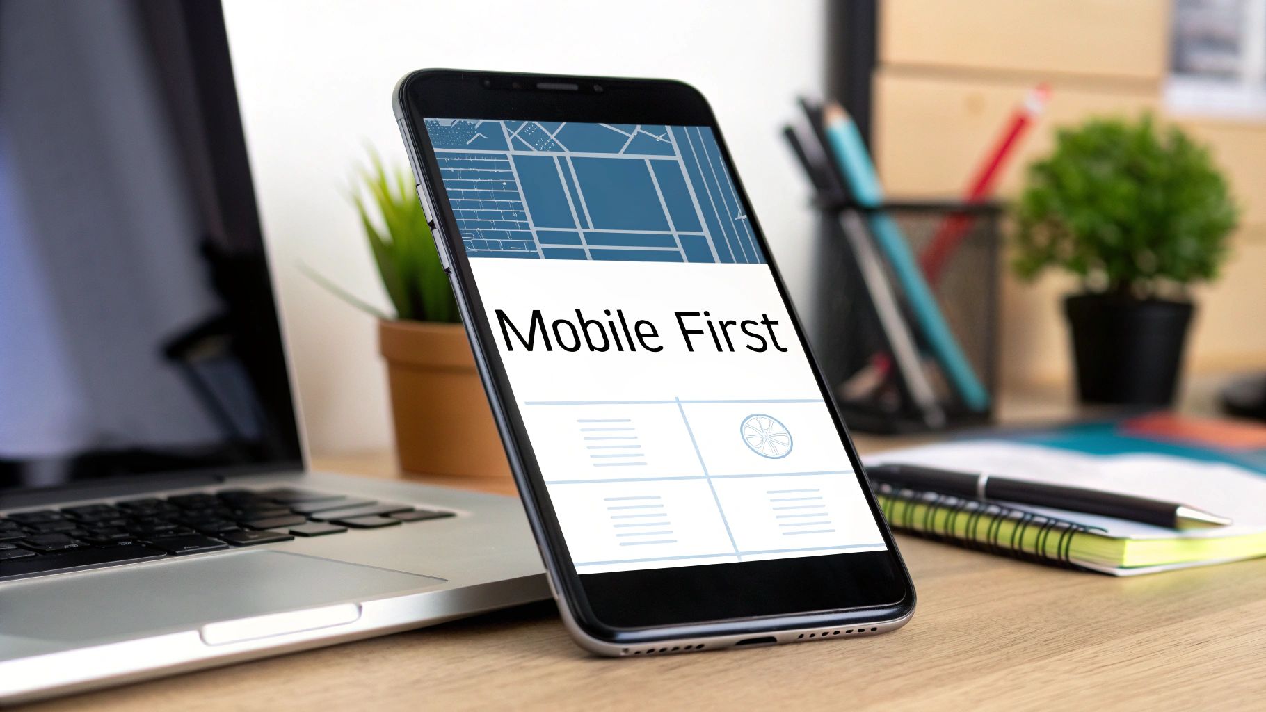
By focusing on core content and functionality for the smallest screen first, you ensure a lean, fast, and highly functional experience for mobile users. As you move to larger screens like tablets and desktops, you can progressively enhance the design by adding secondary features, more complex layouts, and richer media. This "progressive enhancement" ensures the app feels native and optimized for every device, not just a scaled-down version of a desktop site.
Why It's a Game-Changer#
Adopting a mobile-first mindset leads to a cleaner, more intuitive user interface. It prevents the common issue of "graceful degradation," where mobile versions of apps often feel cluttered and slow because they are afterthoughts. Great examples of this in action include Spotify's seamlessly optimized interface, which prioritizes playback controls on mobile, and Twitter's responsive design, which ensures a consistent yet tailored experience across its mobile app and website.
Actionable Implementation Tips#
To effectively implement mobile-first design, follow these key steps:
- Start Small: Begin your design process with the smallest common viewport, typically around 320px width. This establishes your core content and functional hierarchy.
- Use Relative Units: Build your layout with flexible units like percentages (%),
em, andreminstead of fixed pixels (px). This allows your UI elements to scale fluidly across different screen sizes. - Prioritize Ruthlessly: Identify the absolute essential features a user needs on the go. Everything else can be added as screen real estate increases.
- Test on Real Devices: While browser simulators are useful, nothing beats testing on actual iPhones and Android devices. This helps you identify touch target issues, performance lags, and real-world usability problems that simulators might miss.
2. Intuitive Navigation Patterns#
An app can have the most groundbreaking features in the world, but they are useless if users can't find them. This is why establishing intuitive navigation patterns is a cornerstone of effective mobile app UI design. This practice involves using familiar, predictable navigation systems that align with user expectations and mental models, reducing cognitive load and making the app feel effortless to use. It’s about creating a clear roadmap for your users to follow.
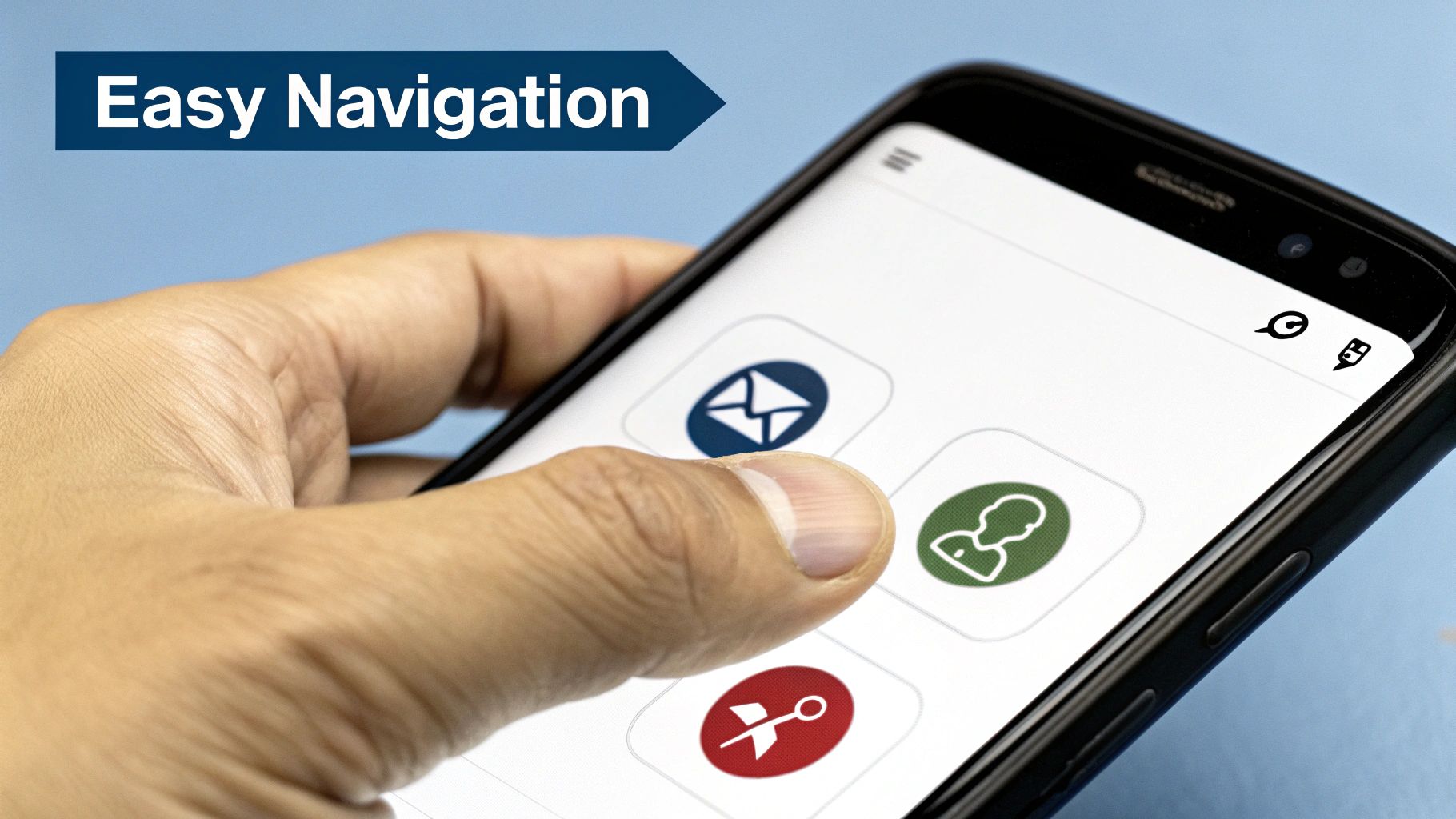
Instead of reinventing the wheel, this approach leverages established conventions popularized by guidelines from Apple and Google. By using common patterns like bottom tab bars, hamburger menus for secondary content, or card-based navigation, you tap into users' existing knowledge. This allows them to move through your app confidently from the moment they open it, without needing a tutorial or frustrating trial-and-error.
Why It's a Game-Changer#
Clear navigation is the backbone of a positive user experience. When users can predict where to find information, they feel in control and are more likely to stay engaged. Great examples include Instagram's simple bottom tab bar that provides instant access to its five core functions, and Slack's organized sidebar that makes switching between channels and conversations seamless. These apps succeed by making complex functionality accessible through simple, consistent navigation. The end goal is to make discovery feel natural, not like a puzzle.
Actionable Implementation Tips#
To design a navigation system that feels like second nature to your users, follow these proven tips:
- Limit Primary Options: Keep your main navigation, like a tab bar, limited to 3-5 essential destinations. This prevents decision paralysis and keeps the interface clean.
- Use Icons with Labels: While icons can save space, they can also be ambiguous. Pair them with clear, concise text labels to remove any guesswork for the user.
- Maintain Consistency: Your primary navigation should be persistent and appear in the same location on every relevant screen. A user should never feel lost or wonder where the controls went.
- Provide Visual Feedback: Clearly indicate the user's current location in the app. Use visual cues like a different color, a bolder icon, or an underline to show which navigation item is currently active. To validate if your chosen patterns are truly intuitive, you can learn more about a comprehensive guide to mobile app usability testing.
3. Thumb-Friendly Touch Targets#
How users hold and interact with their phones is a critical factor often overlooked in the design process. One of the most essential mobile app UI design best practices is creating thumb-friendly touch targets. Popularized by research from experts like Steven Hoober, this principle focuses on designing interactive elements that are easy to reach and tap accurately with the thumb, which is the primary digit used for mobile navigation. It’s about understanding the natural ergonomics of phone usage and building an interface that feels comfortable and effortless.

This approach acknowledges that most users navigate apps with one hand, meaning their thumb has a limited range of motion. The screen can be divided into zones: an "easy to reach" zone (typically the bottom arc of the screen), an "okay" zone, and a "hard to reach" zone (the top corners). Placing key actions and navigation controls within the easy-to-reach thumb zone significantly reduces physical strain and improves task completion speed.
Why It's a Game-Changer#
Designing for the thumb isn't just about comfort; it's about reducing errors and user frustration. When buttons are too small or placed in awkward locations, users are more likely to make mistakes, leading to a clunky and annoying experience. Apps like WhatsApp and Uber excel at this. WhatsApp places its chat input bar and send button at the bottom for easy access, while Uber's prominent "Confirm Pickup" button sits squarely in the thumb zone, making a critical action simple and fast. This thoughtful placement makes the app feel intuitive and user-centric.
Actionable Implementation Tips#
To effectively implement thumb-friendly design, consider these vital steps:
- Map the Thumb Zone: Design your key interaction points to fall within the natural arc your thumb makes across the screen, primarily the bottom third. Place primary CTAs, navigation bars, and frequently used icons here.
- Size Matters: Follow platform guidelines, like Apple's recommendation of at least a 44x44 point tappable area for all controls. This prevents "fat finger" errors and ensures users can tap accurately.
- Provide Ample Spacing: Ensure there is enough space between interactive elements. This prevents users from accidentally tapping the wrong button, a common source of frustration.
- Leverage Haptic Feedback: For important actions like completing a purchase or deleting an item, use subtle vibrations (haptic feedback) to confirm the user's touch, providing a reassuring sense of completion.
4. Progressive Disclosure and Content Hierarchy#
In the world of mobile screens where every pixel is precious, bombarding users with too much information at once is a recipe for confusion and abandonment. This is where progressive disclosure, a core principle of mobile app UI design best practices, becomes essential. This strategy involves showing users only the most important information upfront and revealing more complex or secondary options as they choose to engage further. It’s about creating a clean, focused journey that respects the user's cognitive load.
Pioneered by interaction design experts like Jakob Nielsen and Alan Cooper, this approach declutters the interface by layering information logically. Instead of presenting every feature and setting on a single screen, you guide the user from a high-level overview down into the details they specifically request. This creates a more manageable and less intimidating experience, especially for first-time users.
Why It's a Game-Changer#
Progressive disclosure makes complex applications feel simple and intuitive. By hiding advanced features until they are needed, you allow new users to get comfortable with the core functionality without feeling overwhelmed. Great examples include Slack’s collapsible sidebar, which lets users hide channels and direct messages they don't need, and Apple’s Settings app, which uses a clean list to let you drill down into specific categories. This principle is especially vital during the initial user journey; you can explore a complete app onboarding checklist on nextnative.dev to see how it applies.
Actionable Implementation Tips#
To effectively use progressive disclosure and establish a clear content hierarchy, follow these steps:
- Apply the 80/20 Rule: Identify the 20% of features that 80% of your users will need most of the time. Make these features immediately accessible and place less common functions behind a "More" button, an accordion menu, or a settings screen.
- Use Clear Visual Cues: Ensure users know that more information is available. Use familiar icons like chevrons (
>), plus signs (+), or downward arrows (▼) to indicate expandable sections or drill-down navigation. - Test Your Hierarchy: Don't just guess what's important. Use user testing methods like card sorting or tree testing to validate your information architecture and ensure users can find what they're looking for intuitively.
- Provide Easy Access: While secondary features are hidden, they should never be difficult to find when needed. The path to access them should be logical and consistent throughout the app.
5. Consistent Visual Design System#
A design system is the single source of truth that groups all the elements needed to design and develop a product. It's one of the most critical mobile app UI design best practices for scaling effectively. Far more than just a style guide, a robust design system includes components, patterns, and clear guidelines on how to use them. This ensures every screen, interaction, and user flow feels like part of one cohesive, predictable experience.
Think of it as a set of high-quality, reusable building blocks. Instead of designing a button from scratch every time, you pull the pre-defined, pre-tested button component from your system. This approach, popularized by methodologies like Brad Frost's Atomic Design and systems like Google's Material Design, streamlines the entire product development lifecycle, from concept to code. It bridges the gap between designers and developers, creating a shared language that accelerates work and eliminates inconsistencies.
Why It's a Game-Changer#
Implementing a design system moves your team from making isolated design decisions to building a scalable, efficient, and unified product. It significantly reduces design debt and ensures that as your app grows in complexity, the user experience remains intuitive and familiar. Great examples include Spotify's iconic brand identity, which is enforced through its design system, and Shopify's Polaris, which ensures a seamless experience for millions of merchants across its platform. This consistency builds user trust and makes the app easier to learn and navigate.
Actionable Implementation Tips#
To build a design system that works for your team, consider these practical steps:
- Document Everything: Create a "living" document or website for your design system. Detail all elements, from color palettes and typography scales to component states and interaction logic. Explain the why behind each decision.
- Start with an Audit: Before building new components, audit your existing app. Identify inconsistencies and gather all unique UI elements. This inventory forms the foundation of what needs to be standardized.
- Involve Developers Early: A design system is for both designers and developers. Involve your engineering team from day one to ensure components are built to be reusable, accessible, and performant.
- Establish Governance: Decide how the system will be maintained. Who can contribute? What is the process for proposing, reviewing, and adding new patterns or components? A clear governance model prevents the system from becoming outdated or chaotic.
6. Microinteractions and Feedback Systems#
A key part of excellent mobile app UI design best practices involves mastering microinteractions. These are the small, contained moments that happen when a user interacts with your app. Think of the subtle vibration when you "like" a post, the animation when you pull to refresh a feed, or the sound a toggle switch makes. These tiny details provide immediate, meaningful feedback that acknowledges user actions and makes the interface feel alive and responsive.
Popularized by experts like Dan Saffer, microinteractions transform a static interface into a dynamic conversation between the user and the app. They guide users, prevent errors, and add a layer of delight that can significantly improve the overall user experience. By communicating status and providing feedback, they answer the user's unspoken question: "Did that work?"
Why It's a Game-Changer#
Thoughtful microinteractions make an app feel intuitive and human. For instance, Tinder's iconic swipe interaction provides instant visual feedback, making the decision-making process feel tangible and fun. Similarly, Apple's smooth Face ID animation reassures the user that the system is working to authenticate them securely. These moments reduce cognitive load and build user trust by making the app's behavior predictable and clear. They are the invisible-yet-essential details that separate a good app from a great one.
Actionable Implementation Tips#
To effectively integrate microinteractions, focus on purpose and subtlety:
- Be Fast and Purposeful: Keep animations brief, ideally under 300 milliseconds, to avoid frustrating the user. Each interaction should have a clear purpose, whether it's confirming an action, showing system status, or guiding the user.
- Use Natural Easing: Animations should feel natural, not robotic. Use easing functions (like
ease-in-out) that mimic real-world physics, where objects accelerate and decelerate smoothly. This makes the motion feel more organic. - Cover All States: Design feedback for both successful actions and error states. A subtle green checkmark can confirm a successful save, while a gentle shake and red outline can indicate an invalid input, guiding the user to a solution.
- Prioritize Accessibility: Ensure that your delightful animations are not a barrier. Provide options to reduce or disable motion for users with vestibular disorders, and never rely solely on an animation to convey critical information.
7. Performance-Optimized Loading Strategies#
A visually stunning app is useless if it feels slow. A crucial mobile app UI design best practice is to design for performance by managing what users see while your app is fetching data. Performance-optimized loading strategies focus on minimizing the perceived load time, which is just as important as the actual load time. Instead of showing a generic spinner, these strategies provide visual feedback that the app is working, which keeps users engaged and reduces bounce rates.
This approach, popularized by engineering teams at Facebook and Google, involves techniques like skeleton screens, lazy loading, and progressive enhancement. A skeleton screen, for example, shows a placeholder layout of the final UI, giving the impression of instant loading. This makes the wait feel shorter and more productive because the user can anticipate where content will appear.
Why It's a Game-Changer#
Implementing smart loading strategies directly impacts user retention and satisfaction. Users have little patience for slow apps, and a blank screen can feel like a broken one. LinkedIn effectively uses skeleton screens to preview the structure of its feed, making the wait feel almost nonexistent. Similarly, Netflix progressively loads images, showing a low-quality placeholder first and then swapping it with a high-resolution version once loaded. This ensures content is always visible, even on slower connections.
Actionable Implementation Tips#
To effectively implement performance-optimized loading strategies, follow these key steps:
- Show Structure Immediately: Use skeleton screens to display a content-less version of the UI. This provides an immediate visual response and sets user expectations for the final layout.
- Prioritize Critical Content: Load above-the-fold content first and use lazy loading for images, videos, and components that are off-screen. This drastically reduces the initial load time.
- Optimize Your Assets: Compress images and use modern, efficient formats like WebP. Ensure your assets are appropriately sized for mobile displays to avoid unnecessary data transfer. Learn more about optimizing performance in mobile development.
- Implement Smart Caching: Store frequently accessed data locally on the device. This allows for near-instant loading of previously viewed screens and content, creating a much smoother and faster user experience.
8. Accessibility-First Design Approach#
An often-overlooked yet critical aspect of modern development is the accessibility-first design approach. This practice moves beyond treating accessibility as a final-step compliance check. Instead, it embeds inclusivity into the core of your design process from the very beginning. This means creating mobile interfaces that are inherently usable by everyone, including people with vision, hearing, motor, or cognitive impairments.
Designing with accessibility in mind involves considering how your app will function with assistive technologies like screen readers, ensuring all interactive elements are reachable via keyboard navigation, and building inclusive interaction patterns. By prioritizing accessibility, you not only serve a wider audience but also improve the overall usability for every user, as principles of good accessible design often translate to a clearer and more intuitive interface for all.
Why It's a Game-Changer#
Adopting an accessibility-first mindset is one of the most impactful mobile app UI design best practices because it fosters empathy and expands your user base. Apps like Be My Eyes, which is centered entirely on accessibility, showcase its profound potential. More mainstream examples include Apple's seamless integration of VoiceOver in iOS and Microsoft's inclusive design principles within its Office mobile apps, which ensure features are usable by people with diverse abilities without sacrificing functionality.
Actionable Implementation Tips#
To effectively build accessible mobile apps, integrate these steps into your workflow:
- Prioritize Color Contrast: Ensure all text and meaningful icons meet WCAG (Web Content Accessibility Guidelines) standards. The minimum contrast ratio should be 4.5:1 for normal text and 3:1 for large text.
- Support Assistive Technologies: Label all interactive elements, icons, and images with descriptive text so screen readers like VoiceOver (iOS) and TalkBack (Android) can interpret and announce them correctly.
- Provide Multiple Interaction Methods: Never rely on a single gesture or interaction type for critical actions. For instance, if a feature uses a swipe gesture, provide an alternative tap-based button as well.
- Test with Real Users and Tools: Involve people with disabilities in your testing process. This is a crucial part of a comprehensive mobile app quality assurance strategy, as it provides invaluable, real-world feedback that automated tools cannot capture.
9. Context-Aware Adaptive Interfaces#
Beyond a static layout, one of the most powerful mobile app UI design best practices is creating an interface that intelligently adapts to the user's context. This means the app understands and reacts to factors like location, time of day, device orientation, and even connection quality. Instead of a one-size-fits-all experience, the UI proactively presents the most relevant content and actions, making the app feel incredibly personal and intuitive.
This approach, championed by tech giants like Google and Apple through features like Siri Suggestions, moves beyond simple personalization. A context-aware UI anticipates user needs. For example, a music app might feature upbeat workout playlists in the morning, while a navigation app automatically suggests the route home from the office around 5 PM. It transforms the app from a passive tool into an active, helpful assistant.
Why It's a Game-Changer#
Context-aware design dramatically reduces user friction and cognitive load. By surfacing what the user likely needs right now, it saves them from navigating through menus and searching for features. This makes the interaction feel seamless and almost magical. Google Maps is a prime example, offering contextual suggestions for restaurants when it's lunchtime or highlighting traffic on your common commute route. Similarly, weather apps that change their background and primary data display based on current conditions provide at-a-glance understanding that a static design cannot match.
Actionable Implementation Tips#
To effectively build adaptive interfaces, consider these practical steps:
- Start with Obvious Cues: Begin by adapting to simple, high-impact contextual signals like time of day (e.g., a "dark mode" at night) or location (e.g., showing local store offers).
- Prioritize User Control: Always give users the ability to override or disable adaptive features. Contextual suggestions can sometimes be wrong, and forcing them on users leads to frustration.
- Be Transparent with Data: If you are using location or usage patterns to adapt the UI, be upfront about it in your privacy policy and onboarding. Transparency builds trust.
- Design Graceful Fallbacks: Plan for scenarios where context detection fails. If the app can't get a location fix or network status, it should revert to a sensible default state without crashing or appearing broken.
Key Best Practices Comparison in Mobile App UI Design#
| Item | Implementation Complexity 🔄 | Resource Requirements ⚡ | Expected Outcomes 📊 | Ideal Use Cases 💡 | Key Advantages ⭐ |
|---|---|---|---|---|---|
| Mobile-First Responsive Design | Medium - requires careful planning and hierarchy | Moderate - needs flexible grid system, media queries | Consistent UX, faster mobile load, better SEO | Apps targeting multi-device access, mobile-centric | Faster load times, better SEO, consistent experience |
| Intuitive Navigation Patterns | Low to Medium - based on standard conventions | Low - uses established UI components | Reduced learning curve, better engagement | Apps needing clear, easy navigation | Increases task success, accessibility, user retention |
| Thumb-Friendly Touch Targets | Medium - design for touch zones and spacing | Moderate - testing on various devices needed | Reduced errors, improved accessibility and comfort | Mobile interfaces requiring frequent touch interactions | Reduces frustration, improves accuracy and satisfaction |
| Progressive Disclosure & Hierarchy | Medium - requires layered info and clear cues | Moderate - design & user research intensive | Lower cognitive load, focused task flow | Complex apps with deep content or workflows | Improves focus, makes complexity manageable |
| Consistent Visual Design System | High - extensive upfront design and documentation | High - requires ongoing maintenance and updates | Cohesive brand experience, efficient development | Large apps with multiple screens and teams | Brand trust, reduced dev time, team collaboration |
| Microinteractions & Feedback Systems | Medium to High - needs animation design & timing | Moderate - adds to battery/process usage | Polished feel, clear feedback, enhanced usability | Apps benefiting from dynamic user feedback | Enhances responsiveness, guides users, professional polish |
| Performance-Optimized Loading Strategies | High - advanced techniques like skeleton screens | High - complex implementation for caching & loading | Reduced bounce rates, improved perceived speed | Data-heavy apps or slow networks | Improved performance, offline support, user retention |
| Accessibility-First Design Approach | Medium to High - requires compliance with standards | Moderate - involves assistive tech testing | Broader user base, legal compliance | Inclusive apps targeting diverse abilities | Expands users, improves usability, ensures compliance |
| Context-Aware Adaptive Interfaces | High - data-driven, complex adaptive logic | High - ongoing data collection and user analysis | Highly personalized experiences, efficient task flow | Personalized services, location/time-sensitive apps | Personalization, cognitive load reduction, flexibility |
Bringing It All Together: Your Blueprint for a Superior App UI#
We've journeyed through the critical pillars of modern mobile app UI design, from the foundational necessity of a mobile-first responsive design to the nuanced sophistication of context-aware adaptive interfaces. It can feel like a lot to juggle, but remember that these aren't just isolated rules on a checklist. They are interconnected principles that work in harmony to create a single, cohesive, and delightful user experience. Think of it less as a rigid set of instructions and more as a flexible blueprint for building apps that people genuinely love to use.
The common thread weaving through all these best practices is a deep sense of empathy for your user. When you prioritize thumb-friendly touch targets, you're acknowledging the physical reality of how people hold their devices. When you implement a consistent visual design system, you're respecting their cognitive load and making your app feel familiar and predictable. Every decision, from the speed of your performance-optimized loading strategies to the clarity of your microinteractions, directly impacts how a user feels about your product.
From Theory to Actionable Implementation#
Knowing these principles is the first step, but the real magic happens in the execution. For developers and founders, especially those coming from a web background, translating these design concepts into a functional mobile app can be a significant hurdle. This is where your development approach becomes just as important as your design philosophy.
Let's recap the core takeaways and turn them into your immediate action plan:
- Audit Your Current Flow: Re-examine your app's primary user journey. Where can you apply progressive disclosure to simplify a complex screen? Are your navigation patterns truly intuitive, or do they rely on user guesswork?
- Prioritize the "Feel": Don't underestimate the power of feedback. Implement subtle microinteractions for common actions. A gentle vibration on a successful button press or a smooth animation during a screen transition makes an app feel alive and responsive.
- Test with Real Humans: You can't design in a vacuum. The single most important step you can take is to put your app in the hands of real users. This is non-negotiable for validating your approach to accessibility, navigation, and overall usability. What seems obvious to you might be a major pain point for your audience.
- Embrace Performance as a Feature: A beautiful UI that lags is a failed UI. Continuously profile your app's performance. Implement skeleton screens and lazy loading to ensure that users perceive your app as fast, even when network conditions aren't perfect.
Why Mastering Mobile App UI Design Best Practices Matters#
In today's saturated app market, a functional app is no longer enough. Your UI is your digital handshake, your brand's ambassador, and your primary means of communication with your audience. A superior UI directly translates into tangible business benefits: higher user retention, better reviews, increased conversions, and powerful word-of-mouth marketing. By mastering these mobile app ui design best practices, you are investing in the long-term viability and success of your product. You're building more than just an app; you're crafting an experience that becomes a seamless and valuable part of your user's daily life. This commitment to excellence is what separates a fleeting trend from a lasting, successful application.
Ready to put these principles into practice without the steep learning curve of native development? NextNative empowers web developers to build truly native mobile apps using the tools you already know and love, like Next.js. With a production-ready boilerplate that incorporates many of these UI best practices out of the box, you can go from concept to a polished, high-performance app faster than ever. Check out NextNative to see how you can leverage your existing skills to create exceptional mobile experiences.