A Guide to Mobile App Usability Testing
Updated: July 3, 2025
Let's face it: in a sea of millions of apps, a stellar user experience isn't just a nice feature—it's your app's lifeline. This is where mobile app usability testing comes in, and it's probably the most powerful tool in your arsenal. It’s the simple act of watching real people try to use your app, letting you spot every point of confusion, frustration, and opportunity before they turn into negative reviews and uninstalls.
Why Usability Testing Is Your App’s Secret Weapon#
Today's users have sky-high expectations. They want an app that feels intuitive from the second they open it, with seamless navigation and features that just work. A single confusing checkout step or a brilliant feature that’s too hard to find can be the difference between a five-star rating and an instant uninstall. You simply can't afford to guess what users want. You have to see it with your own eyes.
That's the magic of usability testing. It closes the gap between your brilliant design ideas and what real people actually do when they get their hands on your app. It's not about asking them, "So, do you like it?" It’s about giving them specific tasks and quietly observing where they fly through with ease and where they get completely stuck.
The True Cost of a Poor User Experience#
Ignoring usability isn't just a design misstep; it's a huge financial gamble. The mobile app market is ferociously competitive. In 2022, it was valued at a staggering $208.46 billion and is projected to explode to $777.4 billion by 2032. With that much on the line, an app that frustrates users will get buried. Fast.
This is why looking at usability testing as just another expense is a massive mistake. Think of it as one of the smartest investments you can make in your app's future.
Investing in usability testing early is like paying for a blueprint instead of paying to demolish and rebuild a faulty foundation. It saves money, time, and protects your brand's reputation.
The Direct Benefits of a Tested App#
When you weave mobile app usability testing into your entire mobile app development process, you start seeing real, tangible returns. The feedback you collect isn't just a list of complaints; it's a roadmap to better business outcomes.
Here’s what you stand to gain:
- Improved Retention: When an app is genuinely easy and enjoyable to use, people have a reason to keep coming back. Fixing those little annoyances directly combats churn.
- Higher App Store Ratings: Happy users leave happy reviews. Those positive ratings are gold for attracting new downloads and building credibility in a crowded marketplace.
- Increased Revenue: A user who can effortlessly find a product, complete a purchase, or subscribe to a service is far more likely to do just that. Smooth UX leads directly to conversion.
- Reduced Development Waste: Catching a major navigation flaw in a simple prototype is infinitely cheaper than having to recode an entire live feature that nobody can find or figure out.
Building Your Usability Test Plan#

Jumping into usability testing without a solid plan is a fast track to wasting everyone's time and ending up with a pile of confusing feedback. It’s like trying to navigate a new city without a map—you’ll wander around, but you probably won't find what you're looking for.
A well-thought-out test plan is your blueprint. It’s what turns a vague idea into a focused, efficient process that actually gives you actionable insights. This plan is your guarantee that every test has a purpose, forcing you to define exactly what you need to learn and how you’ll measure it.
From Vague Goals to Sharp Objectives#
The first thing we need to do is get specific. I've seen so many teams start with fuzzy goals like "see if the new feature is intuitive" or "check if the app is easy to use." Those are fine starting points, but they aren't real objectives. A truly powerful objective is something you can measure and tie directly to a user action.
Think about what success actually looks like. Instead of just "testing a feature," reframe it as a question you can definitively answer.
- Vague Goal: Test the new project management feature.
- Sharp Objective: Can a new user create a project, add a task, and invite a collaborator in under 90 seconds without help?
See the difference? This sharp objective instantly gives your test a clear direction. You know exactly what task to give your participants and what to track: time and errors. It’s the difference between asking "Do you like this car?" and "Can you adjust the driver's seat and find the radio presets in under 30 seconds?"
Crafting Realistic User Scenarios#
Once your objectives are locked in, it’s time to write user scenarios. These aren't just a list of instructions; they're short stories that give your users context and a reason to perform a task. A good scenario should feel like something they’d actually do in the real world.
A weak scenario is just a set of directions: "Tap the ‘plus’ icon, type ‘New Project,’ and tap ‘Save.’" This tells the user exactly how to do it, which completely defeats the purpose of the test.
A strong scenario, on the other hand, gives them a goal, not a guide:
"You've just signed up to manage a small team project. You need to create a new project for the upcoming Q3 marketing campaign and add your colleague, Alex, so you can start assigning tasks."
This approach encourages users to explore naturally. You get to see how they interpret your UI to reach their goal, which is the only way to find out if your design is genuinely intuitive. It uncovers the why behind their actions, not just the what.
Selecting Key Performance Indicators#
To know if you’ve met your objectives, you need the right Key Performance Indicators (KPIs). These are the hard numbers that prove whether your design is working. Relying only on subjective feedback like "I liked it" just won't cut it—you need data to back up your observations.
Here are a few essential KPIs I always use for mobile app usability testing:
- Task Success Rate: What percentage of users actually completed the task? This is the most fundamental usability metric.
- Time on Task: How long did it take them? Shorter times usually mean a more efficient and user-friendly design.
- Error Rate: How many mistakes did they make along the way? This helps you pinpoint confusing UI elements or a clunky workflow.
- User Satisfaction: This is often a simple post-task survey, like the Single Ease Question (SEQ), which captures how difficult the user felt the task was.
Tracking these KPIs helps you move beyond anecdotes and into objective analysis. While following established mobile development best practices can certainly minimize issues from the start, your test plan is the final check to ensure theory translates into a great experience. By having a clear blueprint, you're not just hoping for insights—you're engineering them.
How to Find the Right People for Your Mobile App Test#
Let's be blunt: your usability test is only as good as the people you test with. If you get the wrong participants, you’re just wasting time and money. It’s like asking a professional chef for their opinion on your car’s engine—their feedback might be passionate, but it won't help you fix the problem.
Your mission is to find people who genuinely mirror your target audience. This isn't just about pulling in a few warm bodies; it's a careful filtering process. With a staggering 6.92 billion smartphone users worldwide, the pool of potential testers is massive and incredibly diverse. In the US alone, nearly 70% of all time spent on digital media happens on a smartphone. This shows just how critical it is to find people who represent the real behaviors and contexts of your users. You can get a better sense of the mobile landscape in this deep dive on mobile app usability.
Build a Smarter Screener#
Before you even think about where to find people, you need to build your gatekeeper: the screener survey. This short questionnaire is your first line of defense, designed to weed out anyone who isn’t a good fit.
The secret to a great screener is asking about behaviors, not aspirations. If you're testing a new fitness app, a question like, "Do you exercise regularly?" is a trap. Most people want to be the person who exercises regularly, so they'll say yes.
Instead, get specific. Ask questions that reveal actual habits:
- How many times did you work out at a gym in the last month? (e.g., 0, 1-3, 4-8, 9+)
- Which of these fitness apps have you used in the past six months? (Give them a multiple-choice list)
- What’s your main goal when you exercise? (e.g., Build muscle, lose weight, improve heart health)
Questions like these cut through the noise. You get a real picture of who you’re talking to, ensuring the feedback you get during your mobile app usability testing session is grounded in reality.
This is where tracking the right metrics becomes so important. You need to see if the people you're recruiting actually line up with your ideal user profile.
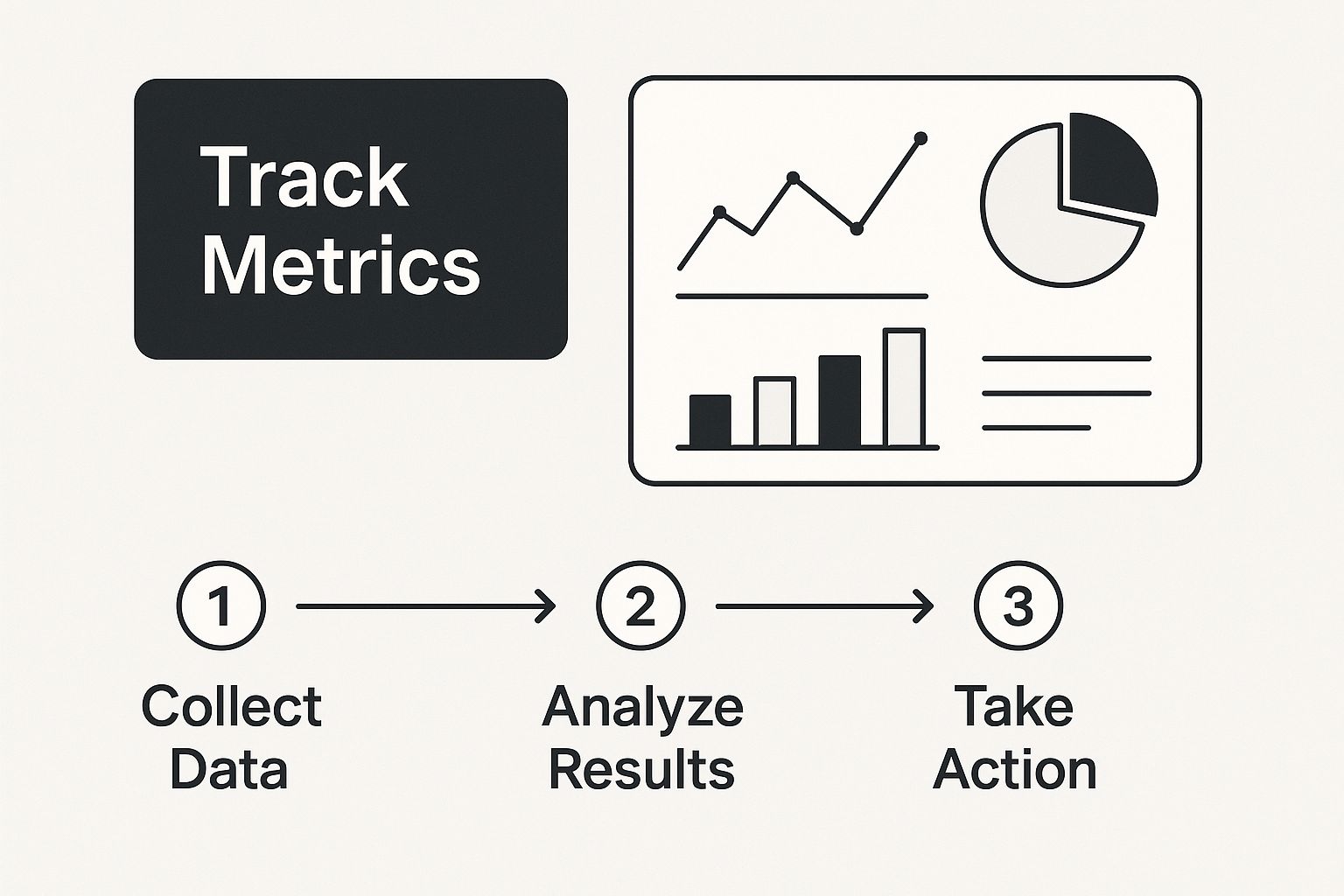
Visualizing the data like this helps you quickly spot if your recruitment efforts are on track or if you need to adjust your strategy to find the right people.
Where to Find Your Participants#
So, where do you actually find these people? There are a few solid channels, and honestly, the best approach is usually a mix of them. This allows you to balance cost, speed, and the quality of participants you bring in.
Finding the right mix of recruiting methods is key to a successful study. Each has its place, depending on your goals, timeline, and budget.
Participant Recruiting Methods Comparison#
| Recruiting Method | Best For | Pros | Cons |
|---|---|---|---|
| Your Own Email/Social List | Validating features with your existing, engaged users. | Basically free; participants are already invested and motivated. | Can create an echo chamber; won't give you a fresh perspective from new users. |
| Recruiting Platforms | Finding very specific demographics or behavioral traits quickly. | Super fast and efficient; gives you access to a huge, diverse pool of testers. | Can get pricey; you risk finding "professional testers" who just want the incentive. |
| Guerrilla Testing | Getting quick, informal feedback on simple flows or early concepts. | Incredibly fast and cheap; gives you raw, unfiltered gut reactions. | Not for complex tasks; participants are completely random and may not be your target user. |
Don't sleep on guerrilla testing. It might sound a bit rogue, but approaching someone in a coffee shop and offering to buy their latte for five minutes of their time can be gold. It’s perfect for getting a quick gut-check on an idea before you pour serious resources into it.
Don't Forget the Human Element#
Finally, remember you’re dealing with people. These aren't just data points; they are individuals giving you their time and focus. Ethical recruitment isn't optional—it's foundational to getting good results.
Be crystal clear from the start. Tell them exactly how long the test will take, what they’ll be doing, and how their data will be handled. A participant who feels respected and in the loop will give you far more insightful feedback.
Always protect their privacy and never, ever share their personal info without getting their explicit permission. And please, compensate them fairly for their time. A gift card, cash payment, or even a product discount shows you value their contribution. It’s how you build trust and encourage the kind of honest, thoughtful feedback that will actually help you make your app better.
Conducting an Effective Usability Session#
You’ve done the planning, you’ve lined up your participants, and now it’s time for the main event. This is where all that preparation pays off, transforming your plan into a goldmine of real, human insights. Your biggest job at this stage is to create a relaxed, judgment-free space where people feel comfortable sharing their gut reactions.
Think of yourself less as a test proctor and more as a curious host. You're not there to teach them how to use the app, defend design choices, or nudge them toward the "right" button. You’re a neutral observer, and your goal is to make the participant the star of the show. Their thoughts, their confusion, and their little moments of delight are the data you're here to collect.
Setting the Stage for Honest Feedback#
Believe it or not, the first five minutes of the session are the most important. This is your window to build rapport and put the participant at ease. Kick things off with a warm welcome and some friendly small talk before diving in. Then, gently set the expectations.
I’ve found that a simple opening script works wonders. I always make sure to cover these points:
- "We're testing the app, not you." This is the golden rule. I say it every single time. Reassure them there are no wrong answers and that they absolutely cannot break anything.
- Encourage raw honesty. I let them know that critical feedback is just as valuable—if not more so—than praise. Their candid thoughts are a gift that helps us make the app better for everyone.
- Introduce the 'think-aloud' idea. Ask them to speak their thoughts as they go. I usually say something like, "As you go through this, just try to say whatever you're thinking. What are you looking for? What do you expect to happen when you tap that? There's no filter needed."
This quick intro completely changes the vibe from a formal "test" to a collaborative chat. A comfortable user is an honest user, and that honesty is the whole reason you're doing this.
Facilitating Without Leading#
Here’s the toughest part of the job: learning to stay quiet. Your biggest challenge during a session is to probe for more detail without accidentally influencing what the user does next. When someone hesitates or looks lost, your first instinct will be to jump in and help. Don't.
Silence is your most powerful tool. Give them a moment to work through it on their own. You’ll be amazed at what you discover when you just wait.
When you do need to jump in, use open-ended, non-leading questions to understand what’s going on in their head.
| Avoid This (Leading Questions) | Try This (Probing Questions) |
|---|---|
| "Did you not see the 'Next' button?" | "What were you expecting to see on this screen?" |
| "So you would click there to continue?" | "What are you looking for right now?" |
| "Was that confusing for you?" | "Tell me more about what you're thinking." |
See the difference? Probing questions keep the focus on their perspective, not on your own assumptions. You’re not asking them to solve the design problem for you; you’re just collecting clues about their experience. The analysis comes later.
A skilled facilitator makes the participant feel like a brilliant detective who is uncovering clues about the app. Your job is to simply hold the magnifying glass and take notes.
Your Pre-Session Technical Checklist#
Nothing kills the momentum of a great session faster than a technical glitch. Whether you're in the same room or thousands of miles apart, running through a quick tech check before you start is non-negotiable. It ensures the focus stays on the user, not on troubleshooting your setup.
Here's the pre-flight checklist I run through before every single session:
- Recording Software is Working: I always do a quick 30-second test recording to make sure my tools (like Lookback or UserTesting) are actually capturing the screen and my voice.
- Device is Ready: The test phone needs to be fully charged, connected to the right Wi-Fi, and have all notifications silenced. A random text message can completely throw off a user's focus.
- Prototype is Loaded: Make sure the correct app version or prototype is loaded up and ready. I also make sure to log out of any previous test accounts to give the user a completely fresh start.
- Have a Backup Plan: What happens if the prototype crashes or the internet connection drops? Always have a backup link or a quick recovery plan in your back pocket.
This little bit of prep work calms your own nerves and, more importantly, shows the participant you value their time. When you’re dealing with different devices and operating systems, being prepared is everything. The technical quirks between platforms are a huge factor when you build cross-platform mobile apps, and they're just as critical to manage during testing. A smooth session is what lets you capture that rich, detailed feedback you came for.
From Raw Data to Actionable Insights#
So, the last test session is a wrap. You're now staring at a mountain of raw material—hours of video, scribbled notes, survey forms, and a jumble of observations swimming in your head. The real work starts now. This is where you transform that chaotic pile of data into a clear, prioritized roadmap for making your app better.
The goal isn't just to list what users did. You need to dig deeper and understand why they did it. This is where you put on your detective hat. You’re looking for patterns, hidden connections, and the root cause of every user's struggle. It’s all about finding the signal in the noise.
Finding Patterns with Affinity Mapping#
One of my favorite, low-tech ways to make sense of everything is affinity mapping. It’s a fantastic method for organizing chaos. You can go old-school with a whiteboard and a pack of sticky notes or use a digital tool like Miro or FigJam. The process itself is surprisingly simple but incredibly effective.
First, just start writing. Go through your notes and recordings. Every time you find a distinct observation—a moment of hesitation, a frustrated sigh, a direct quote, a wrong turn in navigation, or even a moment of delight—slap it on a sticky note. Don't judge or filter anything yet. The point is to get it all out.
Once your wall (physical or digital) is covered in notes, you and the team can start grouping them.
- Look for themes and recurring pain points.
- Cluster similar notes together without trying to force them into pre-made categories.
- Just let the patterns emerge on their own.
You’ll start to see things take shape. Maybe a whole bunch of notes are about confusion during checkout. Another cluster might be all about how frustrating the search filter is. Once you have a group, give it a simple, descriptive name like "Users Can't Find the Save Button" or "Onboarding Instructions Are Unclear." This simple exercise turns a bunch of individual complaints into undeniable proof of a bigger problem.
Prioritizing What to Fix First#
Let's be real: you can't fix everything at once. If you try, your team will burn out and nothing will get done well. Now that you have your themed clusters of issues, you need a system for deciding what to tackle first. Not all usability problems are created equal. A typo is an annoyance. A user not being able to log in? That’s a catastrophe.
A great way to prioritize is with a simple 2x2 matrix that plots issues based on two key factors:
- Impact: How badly does this issue mess up the user's ability to get something important done?
- Frequency: How many of your test participants actually ran into this problem?
This approach immediately creates a clear hierarchy of what needs your team's immediate attention.
Your top priorities will always be the high-impact, high-frequency issues. These are the show-stopping bugs and design flaws that are blocking lots of users from reaching their goals. Fixing these will give you the biggest bang for your buck.
Minor annoyances that only one person hit can be moved to the bottom of the list. This method provides a logical, evidence-based way to decide where to invest your precious development time. It's a core discipline that extends beyond testing and into the entire app creation process, which we dive into more in our guide on mobile app development for beginners.
Telling a Compelling Story with Your Findings#
A boring list of problems won't inspire anyone to act. To get buy-in from stakeholders and your development team, you need to build empathy and create a sense of urgency. You have to tell a story that makes them feel the user's frustration. This is where your qualitative data truly shines.
Instead of just stating, "75% of users struggled with the date picker," show it. Pull a few powerful, short video clips that capture the exact moment a user gets visibly frustrated. Include direct quotes that bring the experience to life, like, "I'm tapping everywhere, but I have no idea how to go back from here."
The stakes are high. Research highlights that mobile apps contribute to about 25% of total revenue in many companies, directly tying app performance to the bottom line. Furthermore, a staggering 75% of companies report that delays in app releases from quality issues lead to losses over $100,000 each year. You can dig into more of these mobile app testing statistics to see the full picture.
When you present this kind of vivid evidence, the problems become real and undeniable. The conversation shifts from abstract arguments about UI elements to concrete discussions about helping actual people succeed with your app. Your final report should be clear, concise, and compelling—one that doesn't just list problems but also offers actionable recommendations to light the way forward for everyone.
Got Questions About Mobile App Usability Testing? We've Got Answers.#
As you start planning your first mobile app usability test, you’re bound to have a few questions. It’s a process that can feel a bit overwhelming at first, but trust me, it’s more straightforward than it seems. Let's walk through some of the most common things that trip teams up and get you the clear, practical answers you need.
How Many Users Do I Actually Need for a Test?#
This is the big one, and the answer is almost always "fewer than you think." For qualitative testing—where your real goal is to find the big, glaring usability problems—you don't need a huge group.
The landmark finding from the Nielsen Norman Group is that testing with just 5 users will uncover roughly 85% of the most critical issues. After that fifth person, you start hearing the same feedback over and over again, and the return on your time drops off a cliff.
The key, though, is that those five users have to reflect your target audience. If your app serves wildly different groups, like buyers and sellers in a marketplace, you'll want to recruit 3-5 participants from each of those segments to get the full story.
Now, if you're running a quantitative test to get hard numbers (like comparing success rates between two designs), you'll need a much larger sample. In those cases, you’re usually looking at 20 users or more to get data that’s statistically sound.
What's the Real Difference Between Moderated and Unmoderated Testing?#
Choosing your testing method really comes down to your goals, your budget, and how much time you have.
With a moderated test, a facilitator is right there with the participant (either in person or remotely), guiding them through the session. This is fantastic for digging into the why behind a user’s behavior. If they pause or seem confused, you can ask them what they're thinking in that exact moment. It’s perfect for testing complex features or early-stage prototypes where you expect things to be a little rocky.
On the flip side, an unmoderated test lets participants complete tasks on their own time. They use a software platform that records their screen and their voice as they think aloud. This approach is way faster, cheaper, and lets you test with a much larger and more geographically diverse group. The trade-off? You lose the ability to ask follow-up questions if a user gets stuck or says something really interesting.
Think of it this way: a moderated test is like a deep, one-on-one conversation. An unmoderated test is more like a widespread, self-guided tour. Both are powerful, but they solve different problems.
What's a Realistic Budget for a Usability Test?#
This can vary wildly, from next to nothing all the way up to several thousand dollars. The main costs you need to plan for are:
- Participant incentives (the thank-you for their time)
- Recruitment fees (if you use a service to find people)
- Testing platform subscriptions
You could run a scrappy, DIY test by recruiting your own customers and just spending a few hundred dollars on gift cards. A typical incentive is around $50-$150 per hour of a participant's time.
A more formal study for about 10 users, using a recruiting agency and a premium tool like UserTesting or Maze, could easily run from $2,000 to $5,000+. Just remember to weigh that against the massive cost of launching an app with show-stopping flaws that turn users away for good.
Can I Test a Competitor's App?#
Not only can you, but you absolutely should! This strategy is called a competitive usability test, and it’s one of the best ways to get a leg up on the competition.
By having users perform the same core tasks on your app and a competitor's, you get a direct, side-by-side comparison of your user experience. It's an incredibly powerful reality check.
This helps you:
- See what your competitors are doing well (and not so well).
- Understand the design patterns users in your market already expect.
- Pinpoint opportunities where you can really shine and differentiate your app.
The goal isn't to just copy what they're doing. It's about understanding the principles behind a great experience so you can make smarter decisions for your own product. While you’re thinking about your competitive edge, don't forget that security is a major differentiator, too. You can learn more in our guide on mobile app security best practices.
Ready to build your mobile app without the headache of native development? NextNative provides a complete toolkit for Next.js developers to create production-ready iOS and Android apps using the web technologies you already know and love. Save weeks of setup and focus on building what matters. Learn more about NextNative and start your project today.